
Does Neocities look like any other blogging systems ? Maybe, maybe not. First, Neocities is a IPFS hosting service. You may not be interested by this social network features.
To perform the analysis, I gathered two types of information:
There is no dedicated API to gather information on Neocities website.
So I gathered the .html pages and extracted the necessary information.
We collected information about 12,531 websites.
There are four types of websites:
| Following | Followed | # | % |
|---|---|---|---|
| Y | Y | 2481 | 20 |
| N | Y | 2853 | 23 |
| Y | N | 6413 | 51 |
| N | N | 784 | 6 |
So most people engage in Neocities activities, as there are only 6\% of people that are not discovered not discovering.
For graph analysis, it’s always difficult to process nodes with very few connections. I decided to discard websites which did not belong to the largest connected components, and following less than $5$ other websites (at the date of 27th of April 2022, I am excluded from my own analysis).
I wanted first to exploit tags, but unfortunately, very few websites add them on their profile. 32\% of them have no tag at all, and the max is 5 (this is fixed by the system). This would be very hard to use, so I keep them for post-analysis.
| Tag count | Proportion |
|---|---|
| 0 | 32 |
| 1 | 21 |
| 2 | 7 |
| 3 | 9 |
| 4 | 9 |
| 5 | 20 |
The keywords’ distribution follows a power-law: very few keywords are largely represented while many others are not.
| Range | \(\geq 1000\) | \(> x \geq 100\) | \(> x \geq 10\) | \(> x > 1\) | \(x = 1\) |
|---|---|---|---|---|---|
| Count | 2 | 21 | 336 | 1760 | 5213 |
You can see that the majortiy of the tags are unique.
We can list the top ones and their number of occurrences:
| Tag | # |
|---|---|
| art | 1664 |
| music | 1070 |
| personal | 950 |
| videogames | 939 |
| programming | 919 |
| games | 392 |
| anime | 369 |
| blog | 348 |
| writing | 322 |
| design | 197 |
| food | 168 |
| technology | 162 |
| html | 155 |
| 90s | 154 |
| education | 135 |
| gaming | 133 |
| photography | 129 |
| comics | 126 |
| javascript | 115 |
| fun | 114 |
| movies | 105 |
| retro | 102 |
| game | 101 |
On the official website here, you can see all the first tag sorted by frequency. For some reasons, I don’t have exactly the same list, but most terms are in both.
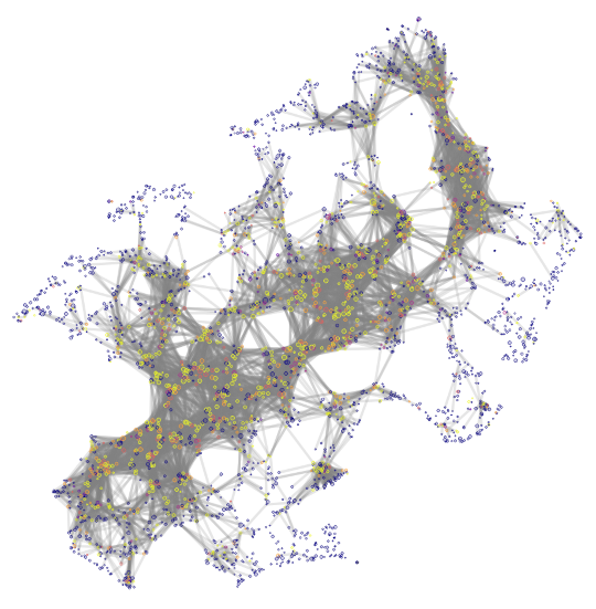
To represent the neighborhood of a node, I performed a Random Walk, where all nodes get weighted based on their accessibility from the current node. Then, I projected the graph using a method previously presented in PolBlog.
We obtain such a map.
You can get the .html version » here «, where you can select and click to access the website.
For visibility, I kept some of the links. Don’t worry about the “color” column, it is just \(\frac{\text{NumberOfTag}}{5}\).
What you can see is a backbone which is made of the largest website in the middle. Then, there are peripheral nodes with almost no followers. This is not a surprise, as weakly connected items are easier to place on the map because there are less constraints on them.
The second thing is that this main website are also the one with many keywords.
>> You can subscribe to my mailing list here for a monthly update. <<